
Hit & Miss
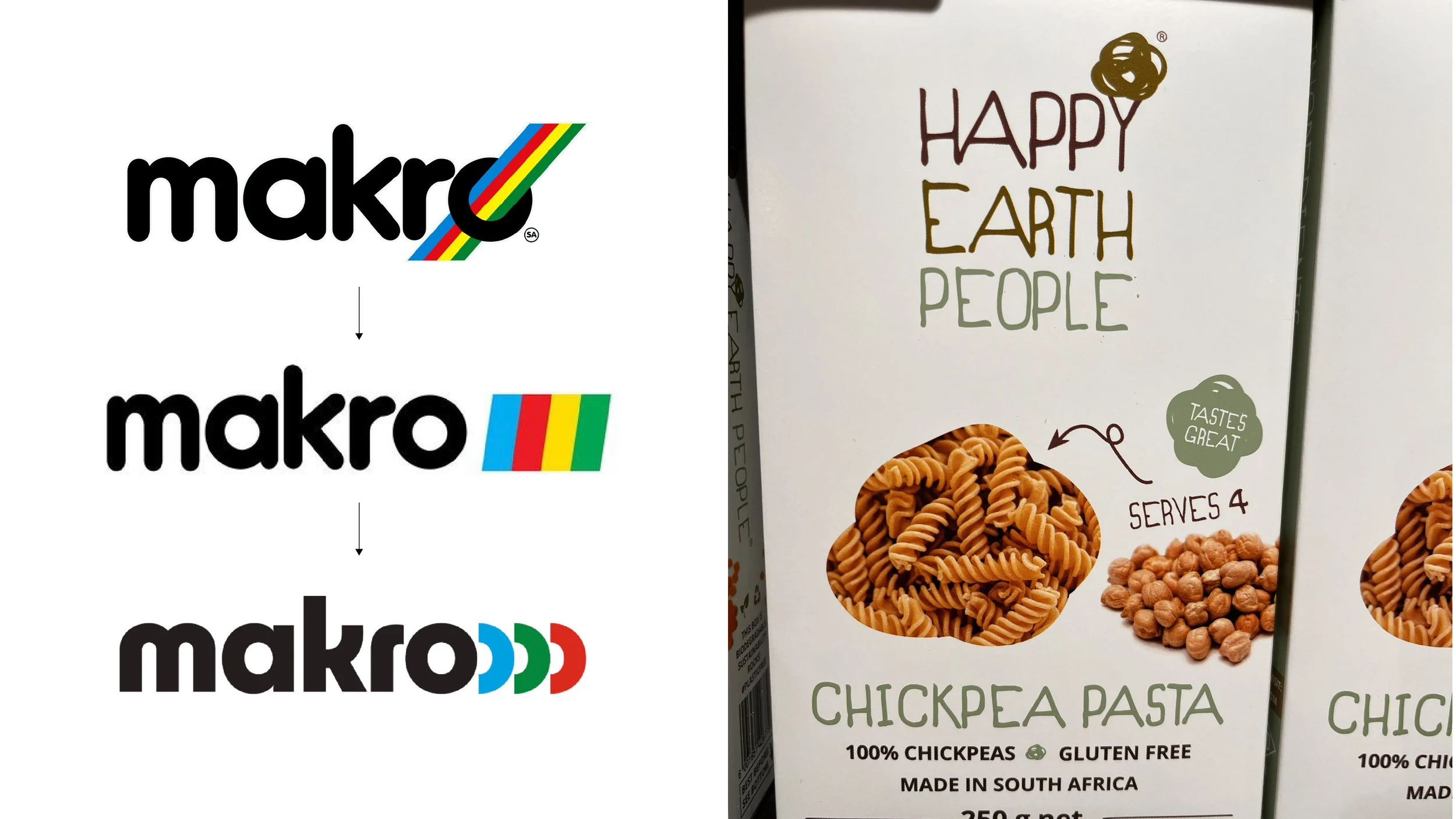
Miss: Makro Logo update
Makro's new logo has left me scratching my head. The company's brand identity appears to be in a state of flux, with each new iteration failing to resonate with me. I'm old school, and I loved the iconic Rainbow logo - it was catchy and made sense with the "everything under one roof" vibe. The "Racing Stripes" that followed were a decent attempt to modernize, but the latest "oooo" logo? Not my cup of Vodka.
It feels like Makro's trying to find its identity through a brand identity, and it's resulting in a disjointed experience. Walking into a store, browsing online, and navigating the aisles all feel like separate puzzles that don't quite fit together.
Maybe it's time for Makro to take a step back, figure out what makes their brand tick, whilst providing a continuous brand experience
Hit: Happy Earth People Packaging
Love the name and what the company stands for “ life-changing power of wholesome, plant-based nutrition for a happy and healthy life” with packaging to match. Clear information hierarchy, earthy colours, yummy images and hand written inspired typography make for great shelf standout value whilst promoting a clean and healthy alternative.
Author Information:
Maciek Michalski - Design Director at Hitchcock Michalski
Maciek Michalski is the Co-Founder and Design Director at Hitchcock Michalski. With over two decades of experience, he is recognized as one of South Africa’s leading creative thinkers, having served as a Loerie Awards design judge seven times and earning accolades including a Loerie Grand Prix, multiple Golds, and Silver awards at Cannes and Clio. Maciek draws inspiration from diverse sources—art, architecture, fashion, and film—beginning each project with pencil and paper to craft authentic, behavior-shifting brand identities. His work spans Africa, Europe, and North America, consistently delivering distinctive brands that resonate deeply.